← All workCASE STUDY 02 · ENTERPRISE UI · SYSTEM EVOLUTION
Designing a Coherent Interface System for a Complex Enterprise Platform
Across five years of product growth, each new workflow had to solve a different problem without becoming a different product.
ONE PLATFORM. MANY TEAMS. COMPLEX REQUIREMENTS TRANSLATED INTO A COHERENT INTERFACE LANGUAGE.
Role
UI/UX Designer
Type
Long-term enterprise product
Years
2020–2025
Focus
Complex workflows / Interface-system evolution
ANONYMISED PROFESSIONAL WORK. PRODUCT AND CLIENT NAMES, BRAND IDENTIFIERS AND SENSITIVE INFORMATION HAVE BEEN REMOVED OR REPLACED. THE SELECTED WORK INCLUDES TWO APPROVED RENEWAL CONCEPTS AND TWO NEW FEATURES IMPLEMENTED IN PRODUCTION. EACH SCREEN IS CLEARLY LABELLED ACCORDING TO ITS DELIVERY STATUS. ALL CUSTOMER AND OPERATIONAL DATA SHOWN IS FICTIONAL MOCK DATA.
The Product
What it is
“Planet” is an anonymised enterprise customer-engagement platform that brought customer management, campaign operations, rewards, content authoring and workflow configuration into one shared environment.
Its purpose
To replace fragmented operational tools with a coherent platform capable of supporting different teams, data structures and workflows.
Who it serves
Campaign, CRM, marketing, customer-support and administrative teams working with different permissions, responsibilities and levels of operational complexity.
Where the complexity live
In the relationships between modules, data, permissions, rules and interface states. Each feature had specialised requirements, but still needed to behave as part of the same product.
Why This Case Study
What it demonstrates
How I translated dense functional requirements into structured enterprise interfaces, reusable interaction patterns and implementation-ready design specifications.
Scale of the work
The central BRD grew from roughly 90 to around 1,200 pages, while the interface work spanned thousands of mockups, workflow states and design variations.
What I contributed
Interface flows, high-fidelity UI, states, interaction notes, icon assets, implementation review and the ongoing extension of an established component library.
Why this product, specifically
It captures the enterprise product experience that shaped how I work today: organising complex systems, preserving consistency across modules and translating product intent into interfaces people can understand and use.
WHY COHERENCE WAS THE REAL DESIGN PROBLEM
Every new module introduced its own data, rules, states and operational needs. Treating each requirement as a standalone screen risked fragmenting the platform and creating a different interaction model for every feature. The challenge was to absorb new complexity without losing the product’s shared language.
THE DESIGN POSITION
I did not approach the platform as a collection of separate screens. I treated it as an evolving interface system.
The BRD defined what the system needed to do; my responsibility was to translate that logic into hierarchy, states and reusable patterns. The goal was to let the product grow without making every new feature feel like a different tool.
01
Approved Renewal Direction
Part of the work explored a broader renewal of the platform’s visual and analytical experience. The two concepts in this section were approved, but the wider renewal was later deprioritised after development resources were reassigned to other company initiatives.
Product Entry Point
APPROVED RENEWAL CONCEPT (NOT IMPLEMENTED)
A redesigned entry point created for the planned product renewal. The screen establishes a focused authentication flow and a distinct visual identity before users enter the operational environment.
UI FOCUS
A focused authentication flow with a single primary action and a clear product entry point.
DESIGN ROLE
Visual direction, form hierarchy and high-fidelity interface for the approved renewal concept.
DELIVERY STATUS
Approved as part of the renewal direction, but not implemented.
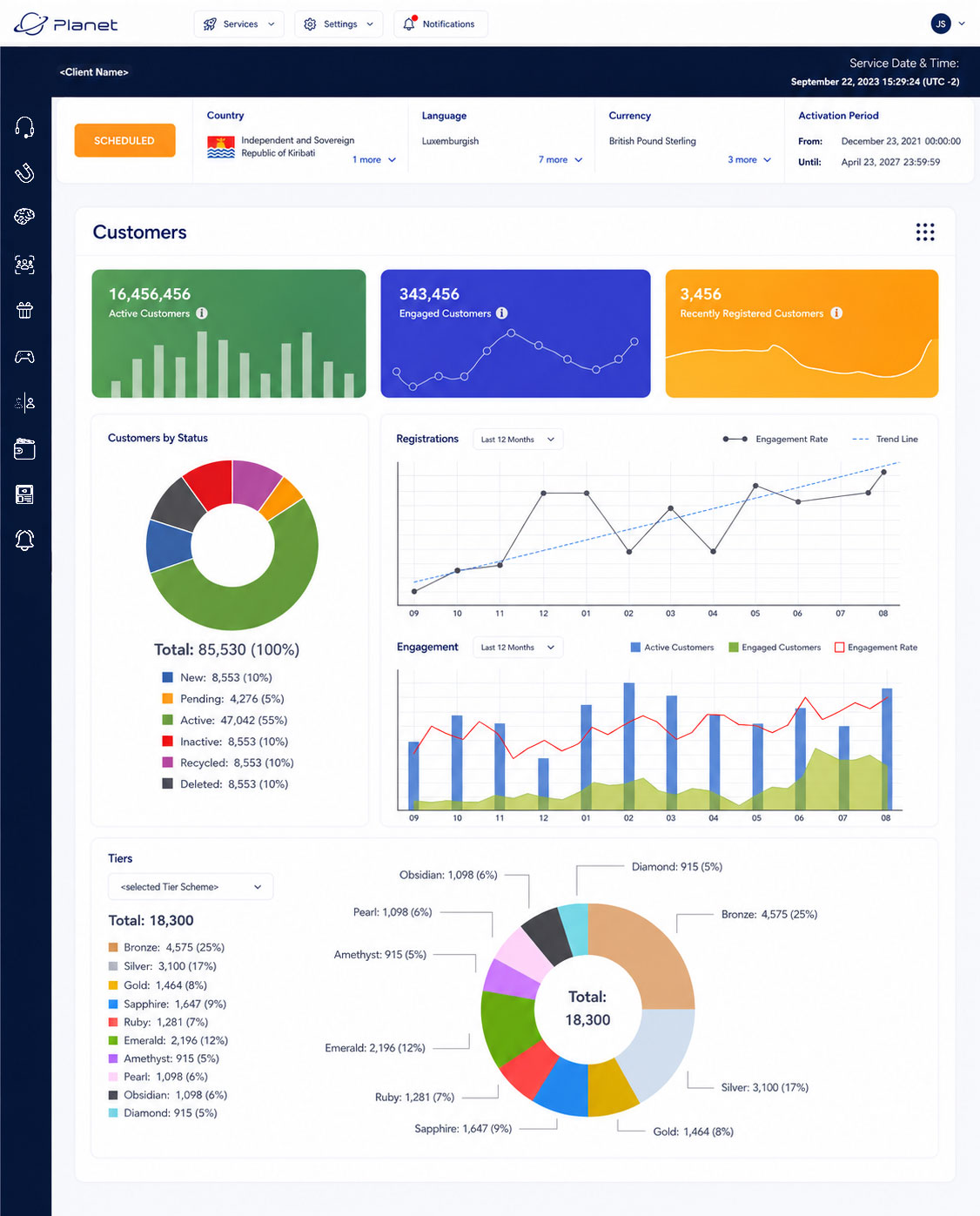
Customer Analytics Dashboard
APPROVED RENEWAL CONCEPT (NOT IMPLEMENTED)
A consolidated view of customer status, registrations, engagement activity and tier distribution.
UI CHALLENGE
Several categories of customer data had to coexist within one analytical view without becoming a collection of disconnected charts.
DESIGN RESPONSE
The page moves from high-level indicators to segmented status data, time-based trends and tier distribution through progressively deeper information layers.
DELIVERY STATUS
Approved as part of the planned renewal. The wider renewal was later deprioritised, so the dashboard was not implemented.
This screen demonstrates analytical hierarchy and data organisation. No outcome claim is made because it was not implemented or observed in operational use.
02
Translating a Growing Platform into Interface Logic
Planet brought together operational areas that had previously been handled through separate systems, including customer management, campaign operations, rewards, content authoring and workflow configuration.
The platform supported several operational groups, including campaign, CRM, marketing, customer-support and administrative teams. Each group worked with different data, permissions, rules and task complexity, while the product still needed to behave as one coherent system.
Product requirements were maintained in a continuously evolving Business Requirements Document. When I joined the project, the BRD was roughly 90 pages long. By the end of my involvement, it had grown to around 1,200 pages.
The BRD defined modules, system behaviour, business rules, data relationships and expected outcomes. It did not define the final interface.
My responsibility was to translate that functional specification into screen structures, hierarchy, interaction flows, states and reusable patterns. For structurally difficult requirements, I sometimes began with paper sketches or rough visual explorations before moving into high-fidelity design.
DESIGN DECISIONS
What should be immediately visible
What should remain secondary but accessible
How complex tasks should be divided into steps
Which established patterns could be reused
Where the interface system needed to evolve
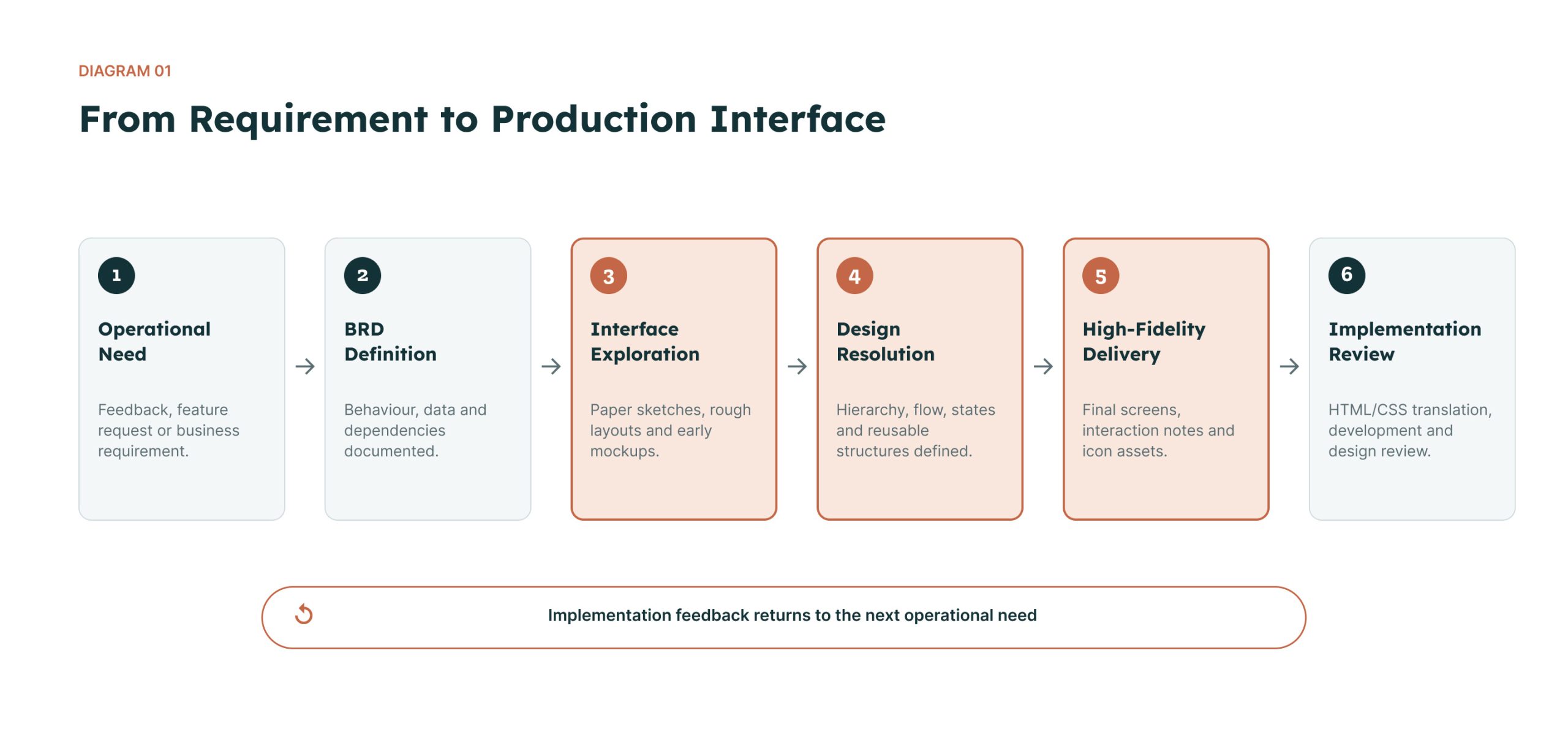
Diagram 01 — From Requirement to Production Interface
The BRD defined what the system needed to do. My role was to determine how that behaviour, data and hierarchy became an interface.
03
Extending an Established Interface System
The product already had a visual and component foundation when I joined. The original UI system had been initiated by the previous UI/UX manager and was maintained in a shared Adobe Illustrator component library, reflecting the team’s production workflow at the time.
During the first months, many new screens could still be designed using the existing set of controls and patterns. As the platform expanded, more specialised workflows exposed the limits of the original basic components.
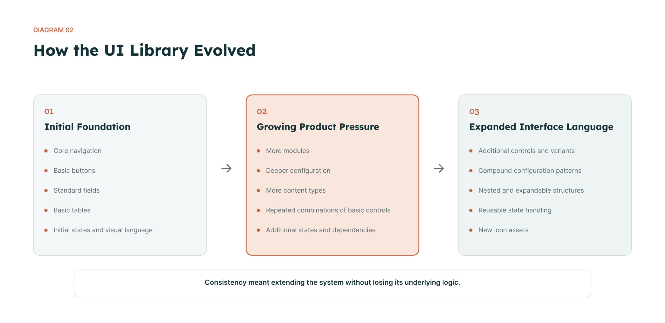
Some requirements could only be supported through repetitive combinations of simpler controls. As new modules and states were introduced, I progressively expanded the shared library with additional fields, controls, icons, variants, compound patterns and configuration structures.
The objective was not to replace the original design language, but to extend it while preserving continuity across the wider product.
Ownership clarification
I did not create the original UI system from scratch. My contribution was to extend and evolve it as the platform’s requirements became more complex.
Diagram 02 — How the UI Library Evolved
Consistency did not mean freezing the original system. It meant extending it without losing its underlying logic.
04
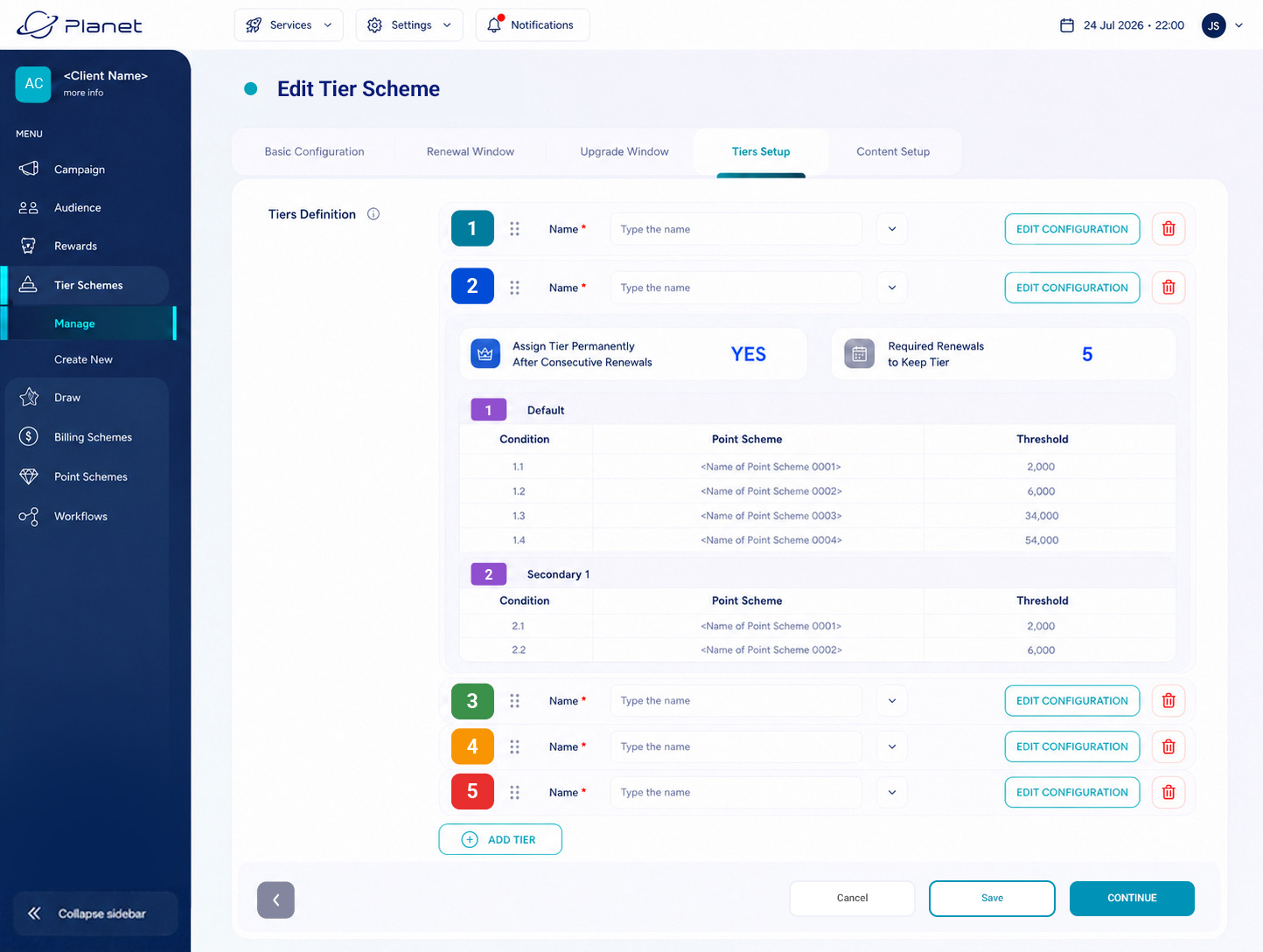
Production Feature: Tier Scheme
The Tier Scheme was designed as an entirely new production feature from requirements documented in the BRD.
The interface had to support multiple tiers, nested rules, thresholds, renewal conditions and repeated configuration structures within one workflow.
NEW FEATURE (IMPLEMENTED IN PRODUCTION)
Used by administrative or programme-management teams to define and maintain a multi-level customer tier structure.
I translated the documented functional requirements into the screen hierarchy, interaction states, repeated configuration patterns and high-fidelity interface. I also supplied interaction notes and icon assets for implementation.
UI CHALLENGE
A large rule set had to remain editable without separating every tier into a disconnected screen or hiding the relationship between the overall scheme and its detailed conditions.
DESIGN RESPONSE
Repeatable tier blocks combine summary information, ordering and deeper rule configuration. Collapsed states preserve overview, while expanded states reveal detailed controls only where required.
DELIVERY STATUS
Designed as an entirely new feature and implemented in production.
05
Production Feature: Question Content
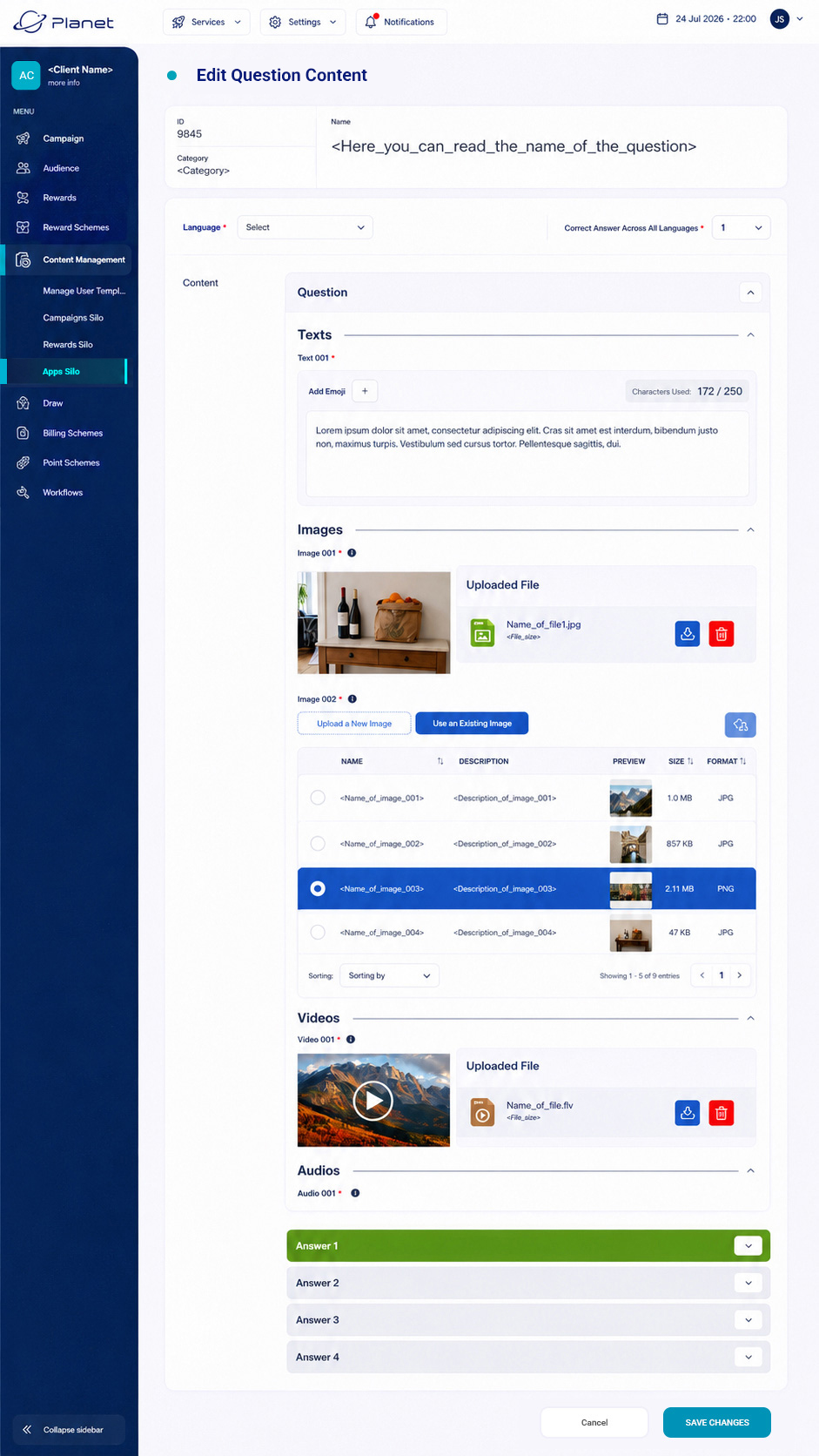
Edit Question Content was another entirely new feature designed from BRD requirements and implemented in production.
It brought together text, language settings, image selection, video, audio and multiple answer states within one long-form authoring workflow.
NEW FEATURE (IMPLEMENTED IN PRODUCTION)
A content-management interface for creating structured questions with multilingual settings and multiple media types.
I defined the content hierarchy, nested editing structure, media-selection patterns, answer states and high-fidelity interface from documented product requirements.
UI CHALLENGE
Several content types had to coexist in one authoring flow without making every section permanently visible or giving secondary media controls the same weight as the core question content.
DESIGN RESPONSE
Nested sections, expandable answer blocks, media previews and repeatable file-selection patterns establish a hierarchy between primary authoring tasks and secondary configuration.
DELIVERY STATUS
Designed as an entirely new feature and implemented in production.
The media shown in this portfolio version has been replaced with AI-generated sample content.
06
Internal Pilot and Delivery Reality
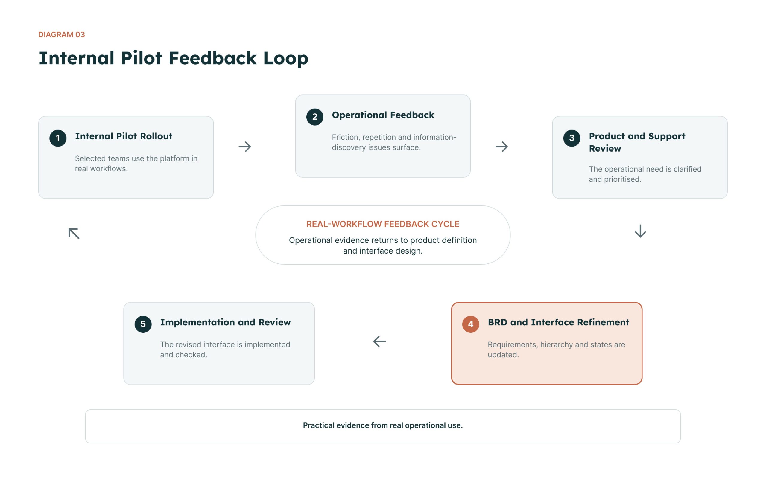
Rather than a formal usability study, the platform was introduced to selected teams across a subset of departments before wider rollout. As those teams used it in real workflows, they returned feedback about repetitive steps, bottlenecks, circular flows, difficult-to-find information and missing shortcuts.
The Product Manager consolidated that feedback and reviewed it with the Product Owner and support teams. Once an operational need had been clarified, it was translated into updated BRD requirements and brought to me for interface exploration. I often began with paper sketches or rough mockups before refining the hierarchy, states and dependencies with the product team.
Delivery involved daily collaboration with the Product Owner, Product Manager and the colleague responsible for translating the interface designs into HTML and CSS. I worked with developers when behaviour or technical details required clarification and reviewed implemented screens against the approved designs.
Product priorities and technical capacity sometimes affected how closely the final implementation followed the approved interface. Reviewing and negotiating that gap became part of the design work.
Diagram 03 — Internal Pilot Feedback Loop
This staged rollout provided practical evidence from real operational use, but it did not produce controlled usability metrics or quantified outcome data.
The role often involved translating between product intent, operational needs, interface clarity and implementation constraints.
07
What Five Years of Enterprise Product Work Changed in My Practice
REQUIREMENTS → INTERFACE
A detailed specification can describe behaviour and data without resolving hierarchy, interaction or comprehension. Translating that gap is a core design responsibility.
SYSTEM EVOLUTION
A shared product language remains useful only when it can absorb new workflows. Reusing basic controls at any cost can create more complexity than it removes.
CROSS-FUNCTIONAL DELIVERY
Enterprise design requires alignment between product intent, operational needs, implementation constraints and different interpretations of interface behaviour.
The Principle
Complex products do not need more interface. They need a coherent language for complexity.
This experience continues to shape how I approach product design today: by translating complex systems into structures people can understand, use and extend.